
Knowledge Base 5 top resources for data dashboard design
Before you start to design a dashboard, ask yourself these 5 questions
There are three main types of dashboard - analytical, operational and strategic. The design you choose should be influenced by your end user, and their goals for the dashboard. However, there are some key design principles that should be observed for all types of dashboard, no matter who the end user is. I’ve divided this article into 5 key questions dashboard designers should be asking themselves, with resources and tips to help you answer each one.
Who is the audience?
This is the primary question you need to ask yourself as a dashboard designer.
Will your users be monitoring trends (strategic), using the dashboard to make operational decisions (operational), or drilling down into the data you present (analytical)? Once you’ve identified your audience and selected the right type of dashboard, you’ll be able to personalise your content to suit them. For example, you can use your customer address data to tweak your dashboard so that it’s geographically relevant, like this example from South Norfolk Council.
You can use postcode lookup, or incorporate address data lists for dashboard personalisation. You can even use personalisation to create different dashboards for different segments of your customer base. Either way, ensure your address data stays up to date with regular data cleansing and accurate address capture.
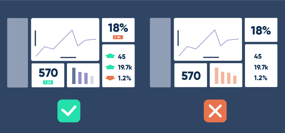
What’s important?
Include only the metrics that matter most to your users. Displaying appropriate data cleanly is the best way to make information accessible to your users.
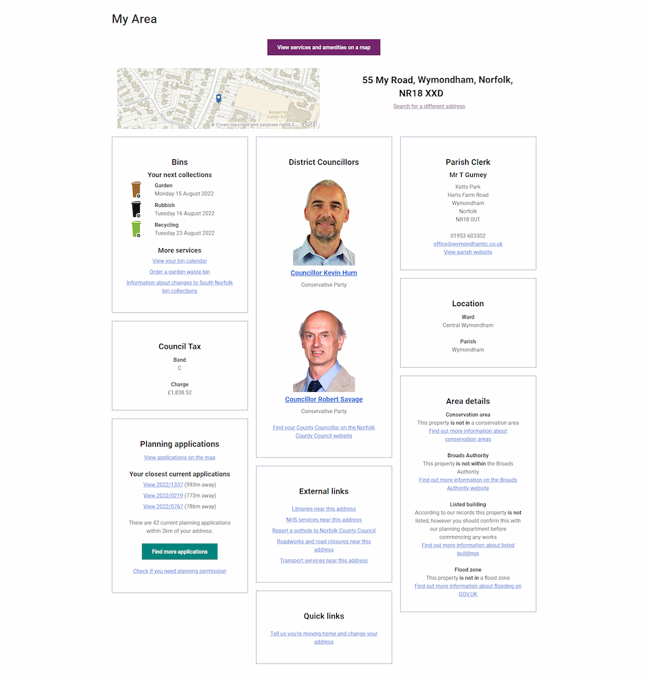
Choose a maximum of 12 cards, ideally only 5 or 6, on your main dashboard.
But how do you decide what’s important enough to include? Consider the metric you want to add and ask yourself:
- Does it align with the purpose of the dashboard?
- Can it be influenced by the user?
- Can it be easily understood?
- Can you use it to detect trends?
However, it’s also important to let users drill down into the detail if they need to. Additional content can be included through the use of tooltips, or other interactive content.
What’s the context?
Where will your audience be looking at the dashboard? Will they be studying a full size monitor in their office, or glancing at their phone screen on the go? Use user research to find out where your dashboard will be displayed, and to whom. For example, a dashboard used in visual presentations will have less detail, but the context will need to be crystal clear to the audience.
Try out different dashboard styles in different contexts and analyse how they perform with user testing software, such as UserZoom.
Finally, to provide all important context no matter where your audience are located, ensure that your labels, legends and styling are consistent throughout.
How long have you got?
Consider how long your user will be looking at the dashboard. In most cases, the information needs to be clear in a few minutes or even seconds. There’s a few easy ways to make your dashboard communicate effectively in a short space of time.
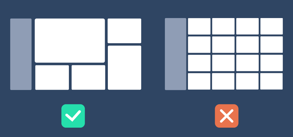
- Remove elements such as unnecessary icons, gridlines or labels that will distract from the data
- Round numbers to a sensible decimal place to ensure they can be read and understood quickly
- Keep layout consistent to allow for easy comparison
Finally, optimise the performance of your dashboard for page loading speed - and make sure you test it with real data. A few extra seconds loading can leave your users feeling frustrated, especially if they’re checking multiple dashboards a day. Tools such as SpeedCurve help you test and compare your performance.
Is your content relevant?
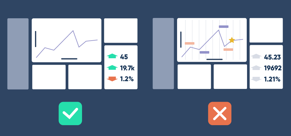
As well as making sure your data is clear and easy to read, you need to keep it relevant. Group related content so that it can be easily scanned.
Provide context to your data - such as whether a figure has climbed or fallen compared to the same datapoint a week ago.
Context is also important to ensure the data you’re presenting doesn’t distort reality. Be careful about the style of chart that you use, and don’t modify scale or units if it makes incremental change seem bigger or smaller than reality.
Finally, keep asking for feedback to ensure your dashboard stays relevant. Services such as Hotjar allow make it easy for your users to let you know how they’re finding your dashboard. Feedback from your users is the best way to improve your dashboard design and create the best possible experience.
Takeaways
Designing data dashboards can be complex. But with careful planning, accurate data and thoughtful design decisions you can create dashboards that are easy to digest.
- Research your audience to find the best style of dashboard for their needs
- Prioritise the most important data cards
- Establish the context in which the dashboard will be viewed
- Style your dashboard to communicate important data fast
- User feedback keeps your dashboard relevant and user friendly
You can get accurate address data lists for UK addresses, businesses and postcode areas from Allies to help you create personalised data dashboards for the best user experience.


