
Knowledge Base How to write user-centred microcopy
Boost your buttons with our short introduction to microcopy
Writing microcopy is the cornerstone of UX writing. It has to be clear and concise to guide users around a product or service.
Microcopy also has to represent the values and tone of voice of the brand. What’s more, it has to clear and understandable by anyone - people of all ages, genders, ethnicities and geographical regions.
That’s a lot of responsibility for a handful of words! With that in mind, here’s our top tips for writing user-centred microcopy.
Make your reader feel at home
Reassure them that they’re in the right place - keep buttons and labels descriptive rather than vague. For example “Create Your Account” is more effective than a vague “Join”.
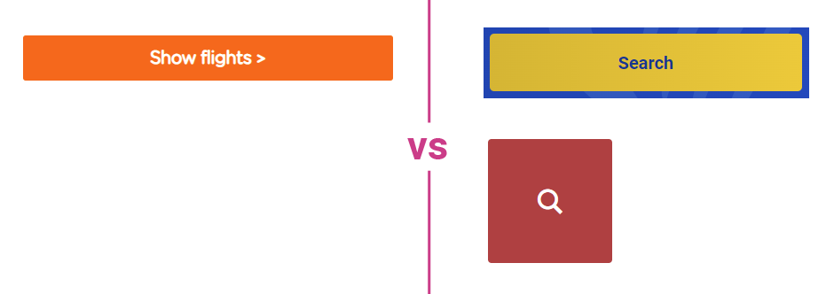
In this example, EasyJet’s “Show Flights” button is much more descriptive that Ryanair’s “Search”, or British Airways who have just used a search icon.
Leave a trail - breadcrumbs allow a user to see what led them to the page. On the page itself, establish a consistent approach of headings, subheadings and links/buttons. This gives your reader a pattern to follow and makes them confident in their next steps. If you’ve got a button on your landing page that says “Start a Free Trial”, then the CTA on your pricing page should say the same. Consistency is key.
Build trust
There’s nothing worse than clicking a menu item and getting a 404 page. First impressions matter when it comes to microcopy. You have to establish trust fast with your readers. Online users won’t stop to re-read, they’ll just move on.
Avoid broken links and images, and ensure the images you do use have descriptive alt tags to make your content accessible.
Avoid out-of-date content, it’s worse than having none at all. If all your customer quotes are dated 2017, your future customers will be questioning whether they’ll be getting an up-to-the-minute service.
Ensure your buttons work and do what they say they’re going to do. Visual feedback is helpful here if a button isn’t taking a user to another page. For example, if you’ve asked your user to verify their email address, make sure you tell them that the address was verified successfully afterwards.
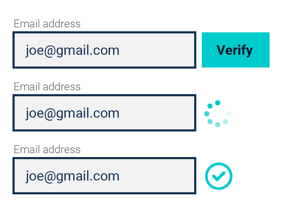
Having verification services for postal addresses, email addresses and mobile phone numbers as part of your online forms and data collection also reassures your user that their deliveries will be sent to the correct address, and they won’t miss any important phonecalls.
Speak in plain language
Say it out loud - it’s the best way to check if you’re writing microcopy in plain language. If your table headings are a tongue twister than rewrite them. Could you replace a vague or complex word with a simple one?
Declutter your writing. This holds true for all writing, whether it’s marketing, content or UX. But it’s crucial for microcopy. Remove superfluous turns of phrase. For example, “In the event that” can be simply shortened to “if”.
Being concise is particularly important for buttons. Do away with unnecessary introductions and use just a handful of words. Remember though, words we use less often are more memorable, so if you want to make a lasting impression on a reader you could try something a bit different. Milan Jovanovic has some more great tips on this.
Grammar matters
What’s the outcome or benefit for the user of clicking the button? That’s what your button or link needs to convey.
Use the imperative for buttons. Buttons that are descriptive but still concise follow a format of verb-noun. For example, “Create Account”, “Sign Up”, “Add to Bag”.
What does your user need to do? Fill-in, click, tap, enter? Make the action needed crystal clear in your button copy or form label.
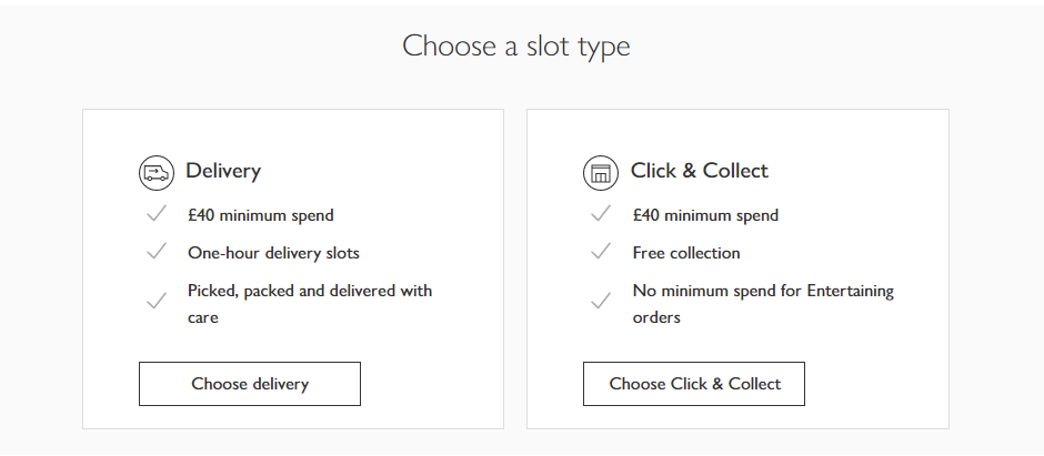
In this example from Waitrose, it’s clear the customer needs to choose either home delivery or click and collect to proceed with their grocery shop.
Takeaways
- Keep your microcopy reassuring, so your user knows what they’re doing
- Build trust with up-to-date content and verification services.
- Check your language is simple by saying it aloud
- Use the imperative for buttons and make the outcome clear


