
Knowledge Base Top 5 usability resources for app design
Tips and resources to make your app designs as user-friendly as possible
Collect sign in details easily
Onboarding is the first hurdle for an app designer. But don’t fear, there are plenty of ways you can make onboarding frictionless for your users.
You can collect sign in details easily by using auto fill to populate fields on sign in and registration forms.
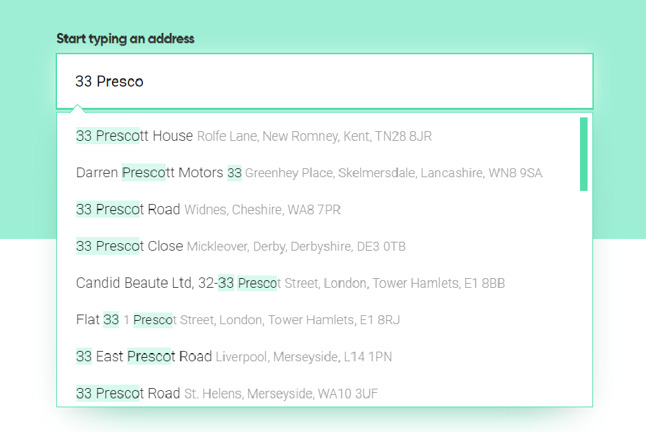
However, be aware that the user may want to use a different address to their home address, particularly for food delivery apps or gift-sending apps. This is where address lookup services can come in really handy.
You can use an address autocomplete or a postcode lookup service, depending on your location and your app interface. They both work to speed up the address capture process, and provide you with a valid address for your customer.
If data is important, validate it
Are you collecting email addresses and phone numbers during your onboarding process? If so, you need to ask yourself if they’re vital to the functionality of your app.
If not, then why do you need to collect them in the first place? It’s just an additional hurdle that could trip up a potential customer.
And if collecting email addresses and mobile numbers is vital? Then make sure they’re valid. You don’t want to lose customers over a mistyped phone number or email address, or worse still risk having your service used fraudulently. Mobile validation services work to verify whether or not a phone number is switched on and can receive calls. This is especially important if you use two-factor validation. Email validation services perform live checks to let you know whether an email is valid, and highlights error such as typos and disposable domains.
Deja vu is a good thing!
Your app might be totally unique, finding a gap in the market and solving a problem that’s been bugging your customers for years. That’s fantastic - but it doesn’t mean your design language has to be totally unique as well. In fact, it will make your app even more user-friendly if you’re using symbols and interfaces that are immediately recognisable, and gestures that are intuitive. This is all about recognition rather than recall, a heuristic that minimises the cognitive load on your users.

You can find icons and symbols on commonly used sites such as Freepik and Font Awesome. Alternatively, you can use templates from Wepik to make your designs more consistent and easy to read. For example, if you’re using a grid-based layout for your app then you can use Wepik’s grid to ensure that every page follows the same layout principles. You can also use the colour scheme templates.
Above all it’s most important to be consistent in your design choices within the app itself. This means your users will quickly familiarise themselves with your app, and prevent them becoming lost or frustrated. They’ll become super users in no time!
Make sure your help is helpful
What else can you do to help ease the cognitive load for your users? Helping them prevent and recover from errors is a great place to start. When errors occur, use plain language to explain the error and let users know how they can rectify it, ideally without having to leave the app.
Help should always be offered in context, for example, stating below a password field exactly which characters are required for a strong and secure password.
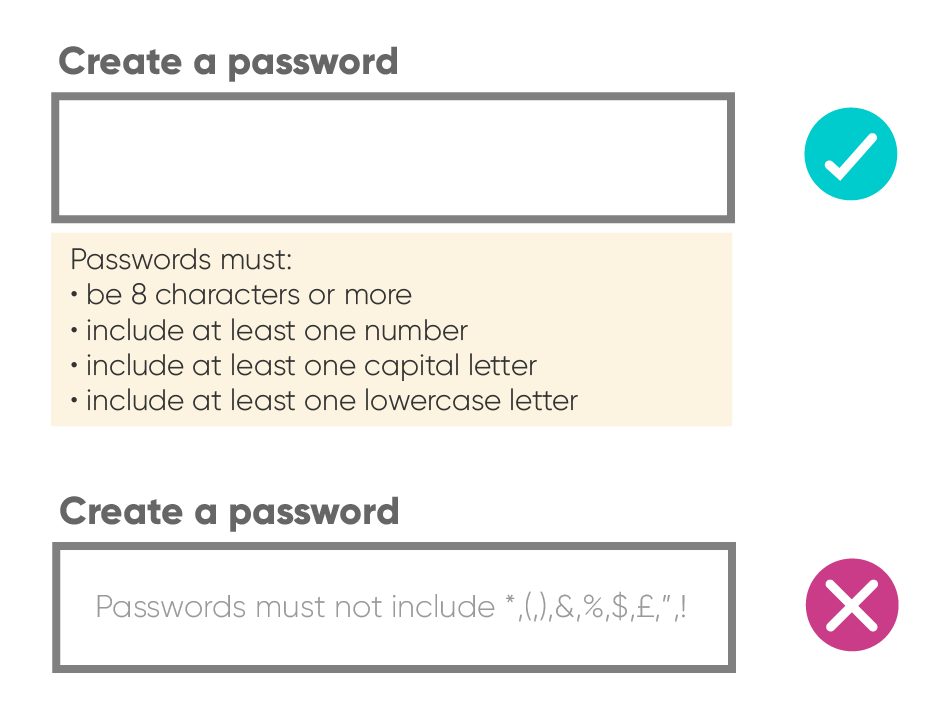
Don’t insult the intelligence of your super-users by providing unnecessary help. However, you may need to nudge new users. Tooltips keep help accessible for your users who are unfamiliar with your app. They can be hidden unless activated with a tap, or automatic to draw attention to a new feature. However, use them sparingly so as not to irritate or distract. The key test of a well-designed interface is whether a user can navigate it without any additional help.
Let your user take control
Even though you want to make things as simple as possible for your users, there will be times when they want to do things for themselves. There’s a fine balance between constricting your users too tightly in an attempt to make a process smooth, and giving them free rein, which could lead to errors or confusion.
While using an address lookup and validation service is generally a good idea for capturing address data, if your app offers a delivery service an additional “delivery notes” field allows your user to append their address with delivery-specific instructions. Visit UXPlanet on Medium for lots more delivery app inspiration.
As well as allowing your users to add detail or customise their choices where necessary, you should always give them the option to undo or cancel an unwanted action. You user might make a mistake, or simply change their mind. Allowing them to undo helps them feel in control. This in turn creates a positive user experience, and will make them more likely to choose your app the next time they pick up their phone.


