Knowledge Base Error tolerant design
What is error tolerant design, and how can we utilise it on our forms and apps?
Everyone makes mistakes. Imagine you’re ordering a food shop online with a new supermarket and you’re in a hurry to make the order cut-off time. You choose your food, enter your address, and hit “confirm”. Phew! Then you scan over the order you submitted and realise your weekly shop is heading to 62 West Wallaby Street instead of 62 West Waverly Street.
Now what? Panic ensues, trying to find a phone number or email address so you can rectify your mistake. You’re being penalised for your error, with the time-consuming process of having to amend it, or face a week of sandwiches for dinner.
This is where error tolerant design comes in. The clue is in the name - it’s a way of designing a system that accepts errors. Or more accurately, a system that does not penalise the user for making mistakes.
How does error tolerant design actually work?
The most effective way of creating an error tolerant design is by preventing the mistake from occurring in the first place. For example, it’s next to impossible to put our cars into reverse by mistake. This is thanks to the reverse gear requiring a combination of gear stick manoeuvres that can only be done with intent.
The second most effective way is through mitigating the effect of errors. We’ve all seen the message that pops up on our laptop screen when we’re trying to delete a file. The extra step allows us to confirm that indeed we do want to delete that tweet, file or photo. It also prevents us from accidently consigning an important invoice to the recycling bin.

How does this work in practice? The bright red button on this tweet-deletion warning will make the average tweeter pay extra attention. It isn’t the same-old blue button used elsewhere when composing tweets. Other design techniques could include making the “Cancel” button more prominent than the “Delete” button.
It’s also important to pay careful attention to the microcopy on warning and error-prevention messages. For example, when attempting to cancel a subscription, someone could be baffled if they were confronted with one button saying “End Subscription” and another saying “Cancel”. The last thing we want is for error tolerance to actually become detrimental to the user experience.
How to use postcode and address lookup APIs to create an error tolerant form design.
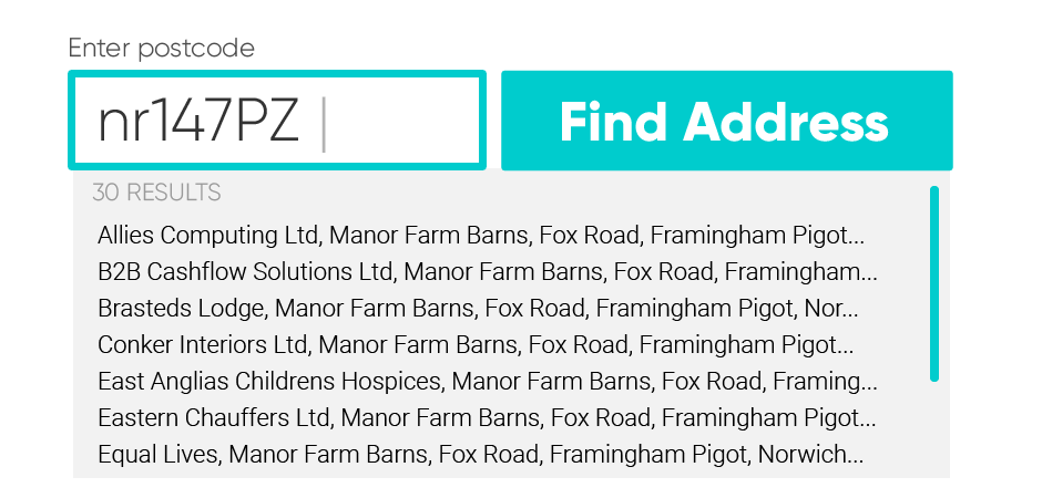
But what about the initial example, a food delivery winging its way to a fictional address across town? This error could be mitigated too, or even prevented. One way of doing this could be using a postcode lookup, so you could select a pre-verified address from a list of those at your postcode. Even the postcode entry box on the form could be made error tolerant. A good postcode lookup API will accept lower case letters, missing spaces or extra spaces and still parse a valid postcode for the lookup request.

Another way could be to use an address autocomplete function. A good autocomplete API will still suggest a correct address despite typing errors made by the person submitting the form. This is something Postcoder handles brilliantly.
Postcoder’s predictive autocomplete can handle human errors such as extra and missing spaces, common typos, phonetic spellings, transposed characters and abbreviated words. This mitigates the human error being made. The user is then presented with a short list of pre-validated addresses to chose from. In turn this prevents an incorrect address being submitted.
If you’re designing a website or app, it’s worth simulating a user journey across your entire purchasing or onboarding flow to work out where common mistakes occur. Then consider how error tolerant design could be employed to mitigate, manage or prevent these mistakes. Your users, error-prone humans just like you, will thank you!


