
Knowledge Base Applying usability heuristics to an ecommerce site
We explore how to use Jakob Nielsen's ten usability heuristics when designing an ecommerce site
Jakob Nielsen developed his usability heuristics in 1990 in collaboration with Rolf Molich. He updated them in 1994, and reviewed them once more in 2020. The 10 heuristics themselves remained unchanged. Despite huge technological change in the intervening 30 years, the principles of usability have stayed the same. In this article we will review the ten usability heuristics as defined by Nielsen [Nielsen 1994a]. We’ll also provide examples of how you can apply them in the creation of an ecommerce site.
1: Visibility of system status
The website or app should always keep the customers informed about what is going on. This means providing appropriate feedback in a reasonable amount of time.
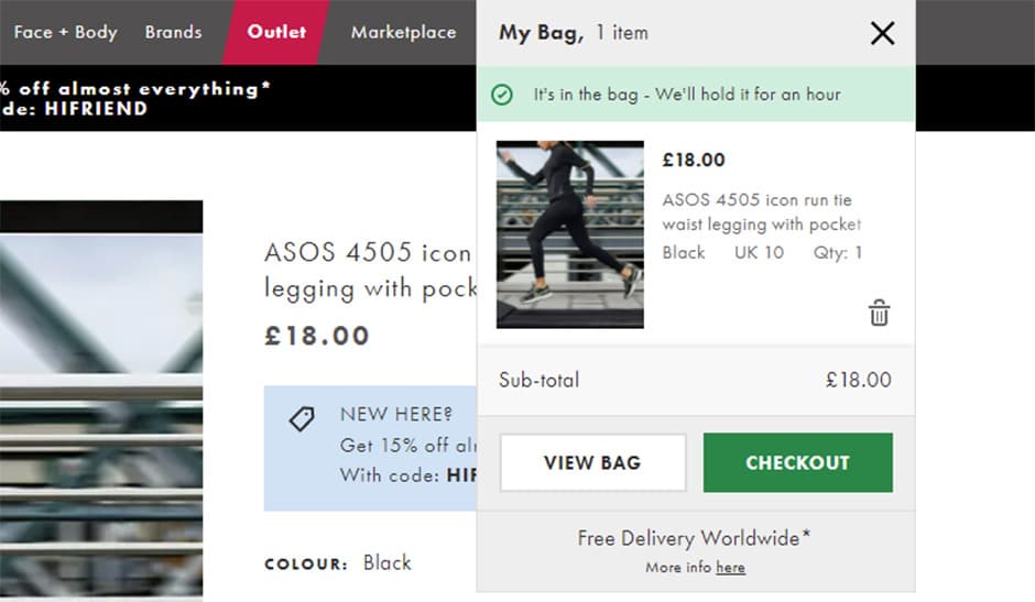
For example, on an ecommerce site, when a customer taps to place an item in their basket, the addition should be visible immediately in the basket at the top of the screen. Visual feedback from the state of the button itself helps too. If your customers are shopping on their phones haptics could also play a role here, to reassure the user that their selection was successful. ASOS for example even uses sound to let the customer know they’ve placed an item in their basket. You’re also informed how long the product will be held for.
Think about which other internal systems could be made visible. For example, you could inform your customers when stock is running low on certain products. You can also prevent users from selecting products which are out of stock.
2: Match between system and the real world
What’s the experience of shopping like in the real world, and does your ecommerce site match up to that? Do a mental walk-through of the average shopping experience, you could even map it out as a user journey. Then do the same mapping process of the user journey on your ecommerce site.
Are you using the same language and conventions as a customer would expect to find in the real world?
- In a clothes shop, a customer would know whether they wanted to start browsing in the Men’s, Women’s, or Kids’ section. (Interestingly, the language used in online clothes shops is considerably less formal than the Menswear and Ladieswear you’d expect to see in a department store. A good reason to back up your assumptions with research about the terminology that feels familiar to your users!)
- Customers would expect to see the latest styles on visual display.
- They would select some clothes they like, perhaps putting them in a basket, and take them to a changing room to try them on and compare them.
- They would hand back the clothes they didn’t like.
- Customers would take their chosen clothes to the checkout.
- They would expect to be able to pay with a variety of clearly outlined methods.
- They would also expect the returns policy to be made explicit, either at the point of purchase or on their receipt.
There’s also likely to be regional variation when it comes to terminology and expectation. For example, in the UK we’d expect to place our purchases in a basket or trolley. In the US it would be a cart. Consider whether your customers are localised or international, and design accordingly.
User research to discover your customer’s familiar terminology and mental models about certain tasks and concepts is vital to building a seamless and intuitive experience.
3: User control and freedom
Users often perform actions by mistake. This is especially common on mobile devices, where it’s all too easy to mistakenly select something with your thumb when you’re only intending to keep scrolling. That’s why it’s so important to provide your customers with a clear option to undo or cancel the unwanted action.
In an online shop, being able to immediately de-select a favourited item or delete something from your shopping basket is an example of this. It might be tempting to make the process tricky to encourage your customers to buy more. However this is a dark pattern that could risk your customer abandoning their basket and leaving your site altogether.
Remember, having an easy exit gives your customers a sense of freedom and control, allowing them to shop with confidence.
4: Consistency and standards
Your ecommerce site won’t be the first one your customers have ever shopped on. It’s important to follow industry standards and ensure consistency with similar sites. The language and patterns you use should be recognisable to your customers, and their actions should have consequences they expect.
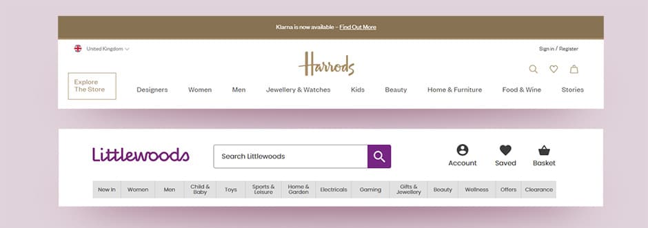
For example, Littlewoods and Harrods are very different department stores with one focused on value and the other on luxury. However, their top level menu items, Men; Women; Beauty; Home etc., are the same.
It’s important to be consistent internally as well, for example when naming products and product families. A good way of doing this is to establish a clear design system that spans your organisation (not just the marketing department). When you introduce a new product there will already be guidelines in place for naming, classifying and marketing it.
5: Error prevention
The best form of error recovery is error prevention. Nielsen outlines two types of errors: slips and mistakes. Slips are errors where the users intent was correct, but they took the wrong action. For example, a customer was distracted while entering their payment details at checkout, so submitted the form with an incomplete card number. Mistakes are errors where the user’s intent was wrong. For example, a form won’t submit because the username is invalid, but instead of changing the username the customer repeatedly changes the password. Both of these errors could be prevented with better design.
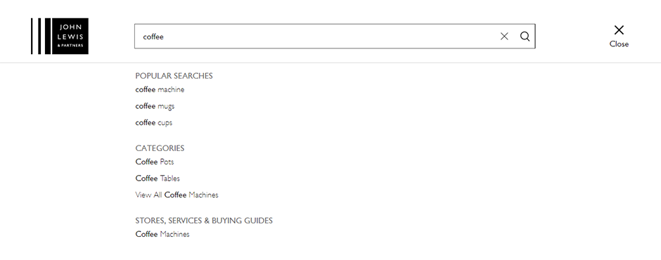
Slips in particular can be tricky to design out, as they can happen even with expert users who are in a hurry, and therefore not paying careful attention. A great example in the context of ecommerce is to offer suggestions, for example in the search bar at the top of your site. This pre-empts any typos from the customer, and allows them to scan the suggestions to pick the coffee-related product they want.
Another area of the ecommerce site where suggestions are great for error prevention is the address form. An autocomplete field allows the user to begin typing their address, and then select their correct address from a verified list. This prevents typing errors on the address form, which in turn prevents errors in delivery and costly returns.
6: Recognition rather than recall
To minimise the cognitive load on your users, present them with recognisable information, rather than forcing them to remember it. For example, make your menu items and field labels visible.
Your checkout form fields are a great place to put this into practice. Make sure each field label is clearly visible at the top of each field, and make sure it stays there. Avoid putting field labels or other information inside fields so that they vanish when the user starts typing. If they can’t remember which field is which while filling out the form, your customer is likely to make mistakes or abandon the checkout altogether.
7: Flexibility and efficiency of use
The use of shortcuts in many apps and software speeds up the interaction for more experienced users.
For savvy shoppers, this flexibility could be implemented by use of a search functionality. If the customer already knows they want a vanilla-scented candle, using the search function allows them to find all the vanilla-scented options without having to wade through menu items. However, it’s still important to provide a clear and logical menu, for less advanced and less decisive users.
Another way of adapting your site to make it more flexible is to provide personalisation. If you know that certain users regularly shop womenswear, provide a landing page of fresh styles when they log in.
8: Aesthetic and minimalist design
This heuristic isn’t simply about styling. Your ecommerce page should not contain information which is irrelevant or rarely needed. Instead focus on the essentials. What’s the most important task your customer needs to carry out on each page? Plan a user journey for your typical customers, and use this to inform the design of your ecommerce site at every stage.
Use visual design principles such as scale, contrast and visual hierarchy. This will keep your customers on track as they make their way through your site.
Resist the temptation to add extra styling and features. Even if a lush animation of flowers in your header is exactly what your brand is all about, it may cost you customers if they can’t work out how to edit their shopping basket because the embellishments are competing with the icons.
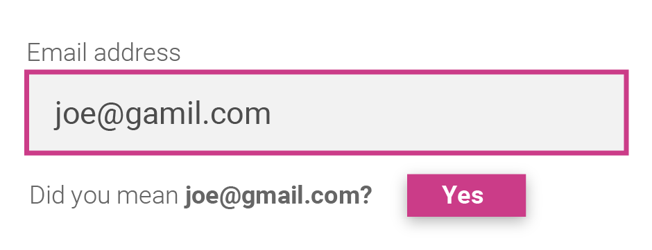
9: Help users recognize, diagnose, and recover from errors
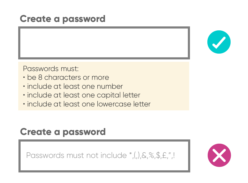
It’s important that when errors occur, your customers are able to recognise them and recover from them. This means using traditional error message visuals, such as red colour or bold text. Don’t rely on the visual warning alone however. Make sure you explain the error in plain language, and let your user know exactly how they can rectify this. Ideally, the error can be fixed directly, without the customer having to go back, or navigate elsewhere.
Email validation services are a great example of user-friendly error recovery. An intelligent email validation API will recognise mistakes or typos, and recommend an instant fix. This means users can correct their mistake with a single click, and no additional navigation.
10: Help and documentation
We all know that it’s best if things just work, without the need for any additional explanation. However in some circumstances, your customers may need some extra information to help them along the way.
You can make the process of asking for help as seamless as possible for your customers by clearly signposting contact channels. A live chat functionality is great for providing help on demand. Many web users are used to looking for a little chat box or chat icon at the bottom of their screens. You can link to a live chat widget from the contact page for less advanced users.
Remember to keep any written help or information concise. Lengthy FAQ sections are not recommended for this precise reason. It’s far better to have a dedicated page linked from a header or footer that outlines your returns policy for example. And it might be a good idea to link to a returns policy from your order confirmation emails too. Remember that help is most useful when it’s contextual, at the moment the user requires it.
Postcoder API just works.
Ensure a seamless shopping experience with Postcoder API.
Find out more about address autocomplete >
Find out more about email validation >
References
- Nielsen, J. (1994a). Enhancing the explanatory power of usability heuristics. Proc. ACM CHI’94 Conf. (Boston, MA, April 24-28), 152-158.


