
Knowledge Base How to correct bias in design
An introduction to acknowledging, challenging and correcting bias in design.
Acknowledge your own bias.
Are you biased? It’s something most people don’t want to admit to, but in reality we are all biased in one way or another, it’s part of being human. None of us can know or remember everything, so we fill the gaps in our knowledge by making assumptions. This fantastic cheat sheet by Buster Benson presents 200 common biases we all grapple with, sorted by three conundrums we all face:
- Too much information and limited attention to give means we filter things out.
- When something lacks meaning, we create a story to make sense of it.
- We don’t have enough time to think things through, so we jump to conclusions.
Before embarking on a piece of design, development or research it’s important to take stock of what our biases might be approaching the project. If research is part of your design process, sit and write down your assumptions about the user you’re about to interview or profile. This can be uncomfortable work and you don’t have to share these with anyone. (However, if you’re working as a team, stating and sharing biases can be a great trust-building exercise.) Once you’ve acknowledged these assumptions you can consciously set them aside while conducting your initial research. You will also be prepared to recognise and acknowledge bias when it creeps into your work further down the line.
Empower yourself to challenge bias
You might have heard of the Five Whys - it does what it says on the tin. When a challenging problem or statement comes up in a workshop or interview environment, you simply ask why… five times. This is a classic design thinking technique that challenges bias in two ways. Firstly, it allows you to dig deeper into somebody’s motivations in a way that bypasses your own assumptions. Secondly, it allows you to use dialogue to find out whether your user’s assumptions are based on something that’s relevant to your research, or simply their own bias. Importantly, this allows for safe exploration of challenging issues.

Life on the edge
Edge cases have been slipping further and further from the mainstream “happy path” of product and service design as new products and features get shipped ever faster. This means that sometimes the most straightforward happy path can lead to a very unhappy ending. In order to prevent this, it’s important to test around and between the intended use of your product or service, right from the get-go.

If you’re having trouble getting out and testing your products for edge cases and different intended uses, there are tools that can help. Cards for Humanity is a fantastic resource that encourages you to think about how your product or design would work for users that you might not even have considered. This is another tool that’s great to have in your back pocket for workshops.
You can also design for cases that may or may not be the intended use of your product by making them error tolerant. We’ve talked about error tolerant design in depth before, using our address autocomplete service as an example. By allowing for human error in your design, you’re also acknowledging that your users may not always be their most capable and functional selves when using your product or service, and that’s OK.
Patterns and habits
It’s inevitable that biased thinking means trying to fit information into existing patterns rather than creating new ones. The problem is, sometimes these old patterns just aren’t that helpful. This is why they’re often renamed anti-patterns.
The alphabetical drop down country list is a great example of a design anti-pattern that popped up recently in a talk by Roger Attrill at the great UCD Gathering conference. This is a tool that’s completely unsuited to user needs, unless of course, your users are from Afghanistan. However it’s still one we see employed on a daily basis.
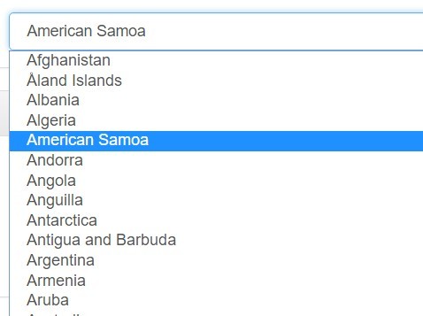
Instead of using a drop down country list on your forms, try autofilling your user’s country based on browser or IP information. Alternatively, an autocomplete field is much more effective than a drop down list.
When trying to correct bias in design, you have to consider whether what you’re doing is defined by your tools. It pays to make the extra effort to find a tool that serves not only your design but your users too, including those you might not normally consider.
Postcoder API for address lookup and form validation
Make life easier for all your users. Postcoder API is a simple way to add address lookup, email validation, mobile validation, bank validation and rooftop geocoding to your forms, products and services.


