
Knowledge Base Top 5 usability resources for designing great ecommerce websites
Here are some tools and articles we've found helpful in our mission to make ecommerce more user friendly.
1. Provide a linear and uninterrupted checkout process
A simple and linear checkout process is the number one thing you can do to improve the usability of your ecommerce site. This article by the Baymard Institute is 10 years old, but still on the money when it comes to checkout design. It provides the original research that proves you shouldn’t force customers to create an account before making a purchase.
An important part of a linear check out experience is by making the system status visible at all times. You can do this with design elements such as breadcrumbs and progress bars.

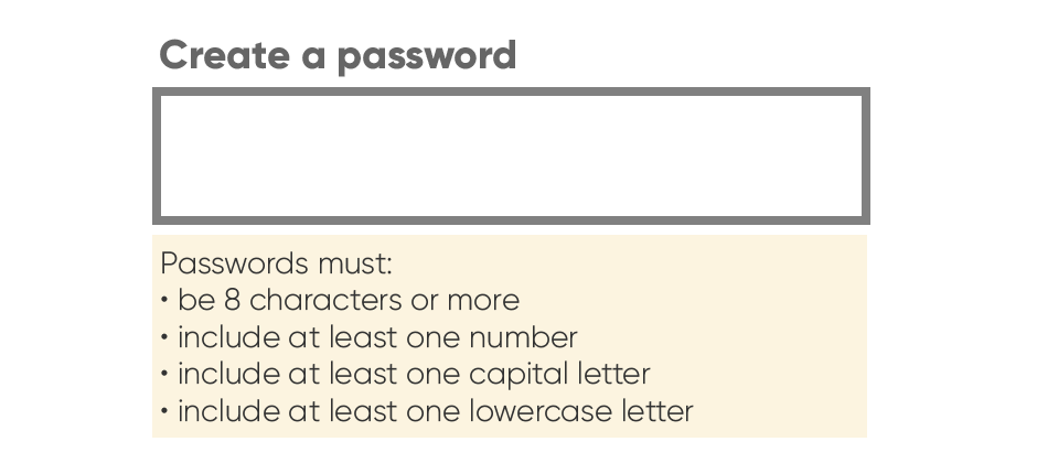
Provide clear error messages if things do go awry, but better still prompt your users to input correct information in the first place. For example clearly state which characters are required for a password.
Don’t get tempted to add superfluous pop ups and reminders. Your customers may get distracted from the task in hand and never return to complete their purchase.
2. Reduce loading times with image compression
A website page that loads fast is crucial for usability. What’s more, it will make your site rank higher on Google. The most effective thing you can do to decrease your page load time is to reduce image sizes. For an ecommerce site this is doubly important - your website imagery is your shop window selling your products.
It’s easy to reduce image sizes with an image compression tool such as Squoosh. You can also try using WebP - an image format that loads even faster.
Another option is to use free stock images instead of your own images. Not only are these images significantly smaller than the originals, but they’re also likely to load much faster due to their size.
Finally - include descriptive alt copy. Your customers who use a screen reader will thank you. It could also make your website accessible to those with particularly slow or intermittent internet connection.
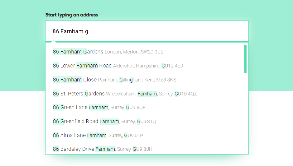
3. Streamline the checkout process with address autocomplete
Entering your address details into a checkout page is the most tedious part of online shopping. Make it easier for your customers by streamlining the process as much as possible. Address autocomplete is a great way of removing steps from the checkout process. Don’t make your customers type out their whole address in multiple form fields. Instead, they can begin typing then select the correct address from a list of matches. This also has the advantage of all the addresses being validated against Royal Mail data to prevent costly delivery mistakes.
If you have international customers then it’s a good idea to use autocomplete for your country field too. Country selection drop down lists are notoriously tedious for users, especially on mobile devices.
Postcoder is a great postcode lookup and autocomplete solution, with support for over 240 countries world wide.
4. Use consistent icons and familiar design patterns
A familiar interface is important to reassure your customers and make their shopping experience seamless, even if they’re new customers. Use familiar icons, and use them consistently, so your users know where to find their shopping basket and favourites. What’s more, make it easy for a customer to move from a search to an item to their basket and back again, using icons or browser buttons.
It’s also important that the checkout process is familiar and reassuring, including the payment gateway. Trust badges, such as SSL seals or trust seals, offer a sense of reassurance to customers that their payment details are being protected. This article from the Baymard Institute goes into detail, discovering that quirks in credit card fields completely erode user trust in the site’s security. Remember, your online checkout doesn’t simply have to be secure, it also has to look secure to convince your customers that their card details are protected.
5. Have help on hand
What happens if, despite our best efforts to cater to our customer’s every need, something goes wrong? It does happen, and some users are more willing that others to search for answers on the website itself. This is where help functions come in. You need to be contactable to help your customer, before you lose them for good.
Depending on your sales volume and staffing levels, this could be as simple as providing a clearly visible phone number in the header or footer of your site. For other sites, a live chat function is invaluable for answering customer queries. Remember though, keep the chat window tucked away, otherwise it’s just another intrusive pop-up. Some simple microcopy and a recognisable widget or icon will make the live chat easy to find if your customer needs it.

If you’ve decided that live chat is the way to go, then delve into live chat UX with these brilliant guidelines put together by the Nielsen Norman Group.
If you’ve enjoyed this article, why not take a look at our guide to designing an international ecommerce checkout?


